UX Audit & Usability Recommendations for Terrano's Online Store
Identifying UX roadblocks and optimizing the user journey for a better online shopping experience.

Kim jest klient?
Terrano is a leading provider of high-quality tiles, bathroom equipment, kitchens, furniture, lighting, carpets, and accessories from top European manufacturers. With over 30 years of experience, Terrano has established itself as a trusted brand in delivering modern solutions for home interiors.
Wyzwanie
Terrano approached us to help identify usability issues that were impacting the customer experience and overall business performance on terrano.pl. The site needed to better support users through clear structure, consistent UI, and accessible navigation—without changing its core functionality. We were tasked with conducting a thorough UX audit using industry-standard methods, including Nielsen’s Heuristics and user path evaluations, to pinpoint friction points and recommend actionable solutions.
Nasze podejście
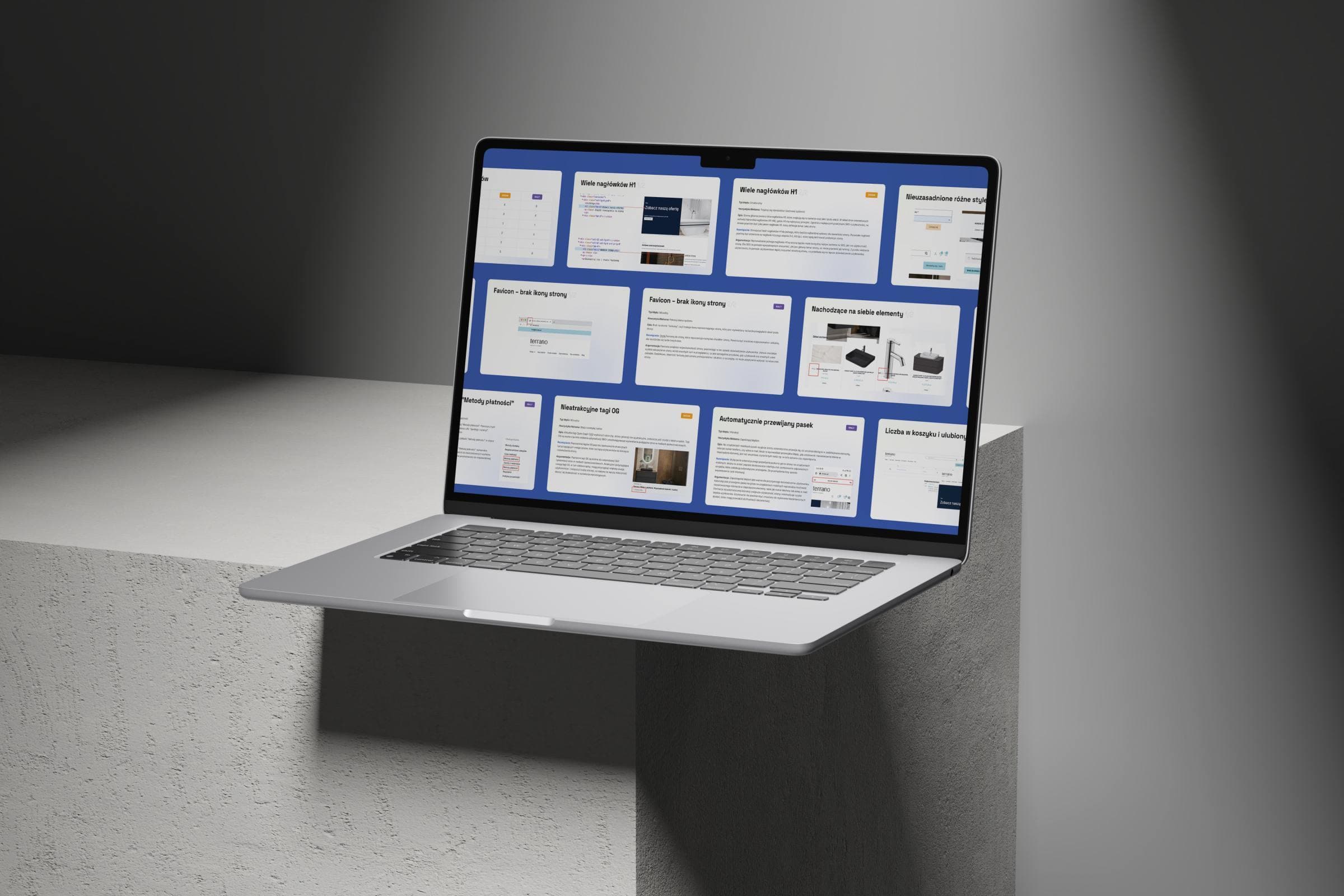
We delivered a complete heuristic analysis of the website, broken down into several usability dimensions. This included:

Heuristic Evaluation
We assessed the interface against Nielsen’s 10 principles, rating each issue based on severity and user impact.

Issue Prioritization
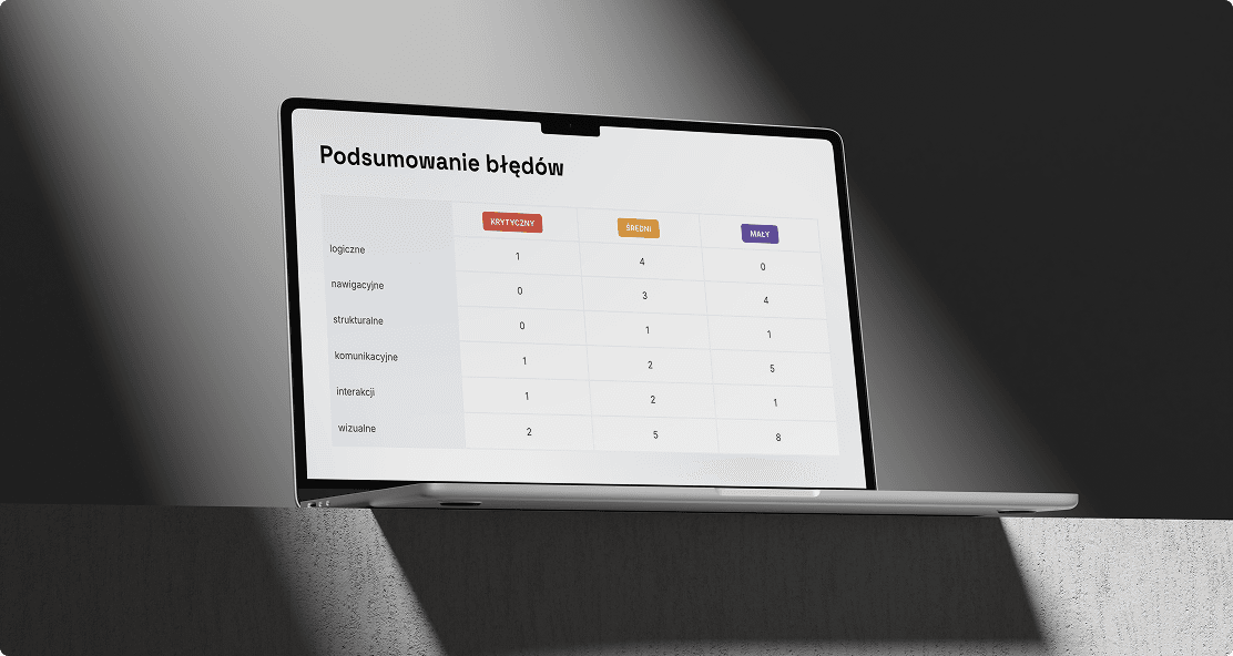
Over 30 usability issues were categorized (critical, medium, low) and linked to their logical, navigational, or visual nature.

Actionable Recommendations
Each problem was paired with a proposed fix and rationale to support technical and design teams during implementation.
Rezultaty
While no redesign was involved at this stage, the audit formed a roadmap for improving Terrano’s UX. Key suggestions included:
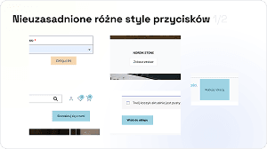
Unifying Button Styles
To reduce confusion and streamline interactions across the interface.
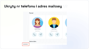
Improved Contact Visibility
Clear labeling of phone and email fields, supporting accessibility and trust.
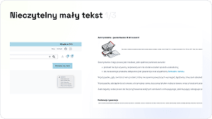
Typography and Spacing Adjustments
Recommendations to standardize font sizes for improved legibility and readability.
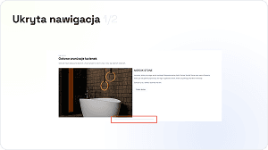
Fixing Navigation Issues
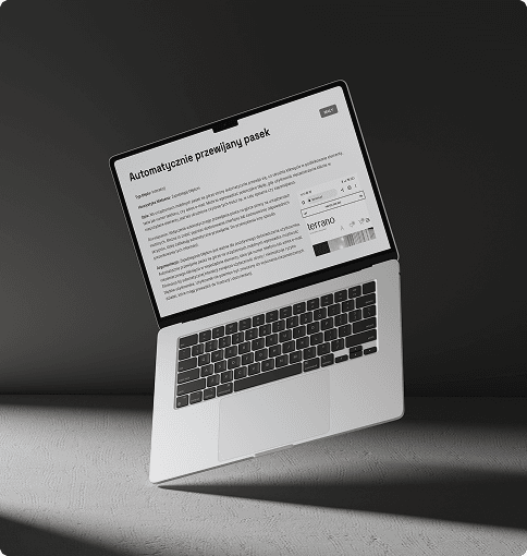
From sliders to menu inconsistencies, we proposed several ways to make browsing smoother and more intuitive.
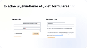
Clarity in Forms and Filters
Ensuring form elements followed standard conventions, labels remained visible, and error messaging was consistent.
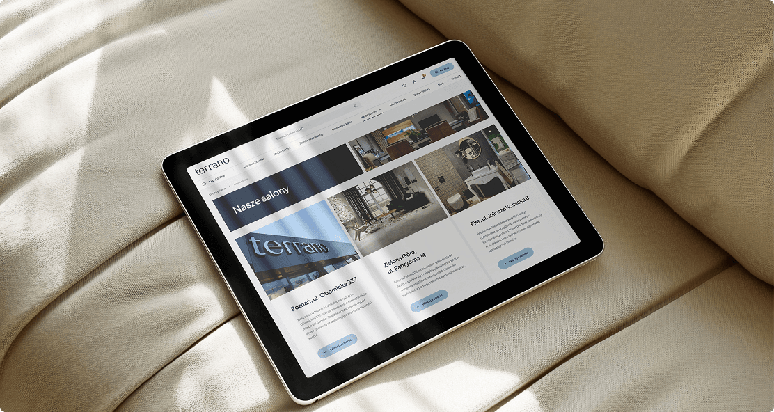
Our UX audit uncovered key usability issues affecting navigation, product discovery, and overall customer satisfaction. The report became the foundation for a complete redesign of the Terrano website—one focused on clarity, responsiveness, and intuitive shopping paths.
The audit helped align business goals with user expectations, paving the way for an experience that better supports customer decisions and conversions.
Trwała współpraca
Following the audit, we partnered with Terrano to bring the recommendations to life through a full-scale website redesign. You can explore that transformation in our Terrano redesign case study.
Our collaboration continues with ongoing optimization and UX improvements, ensuring the platform evolves alongside customer needs and digital standards.
Zobacz także
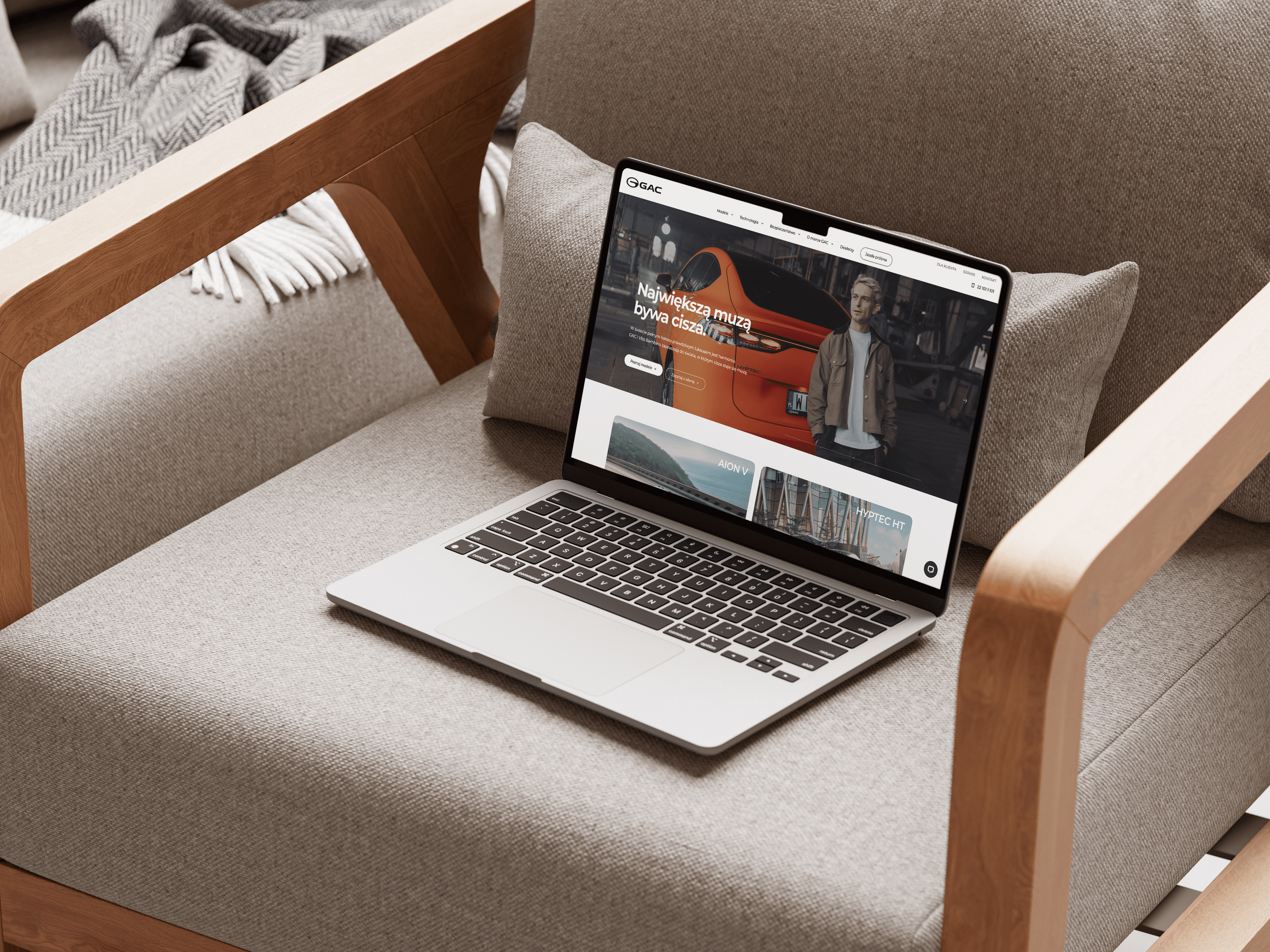

Błyskawiczne wdrożenie nowoczesnej, wydajnej strony internetowej dla oficjalnego dystrybutora GAC w Polsce, wspierającej dalszy rozwój marki i jej obecność na rynku.
Aplikacja webowa i Design
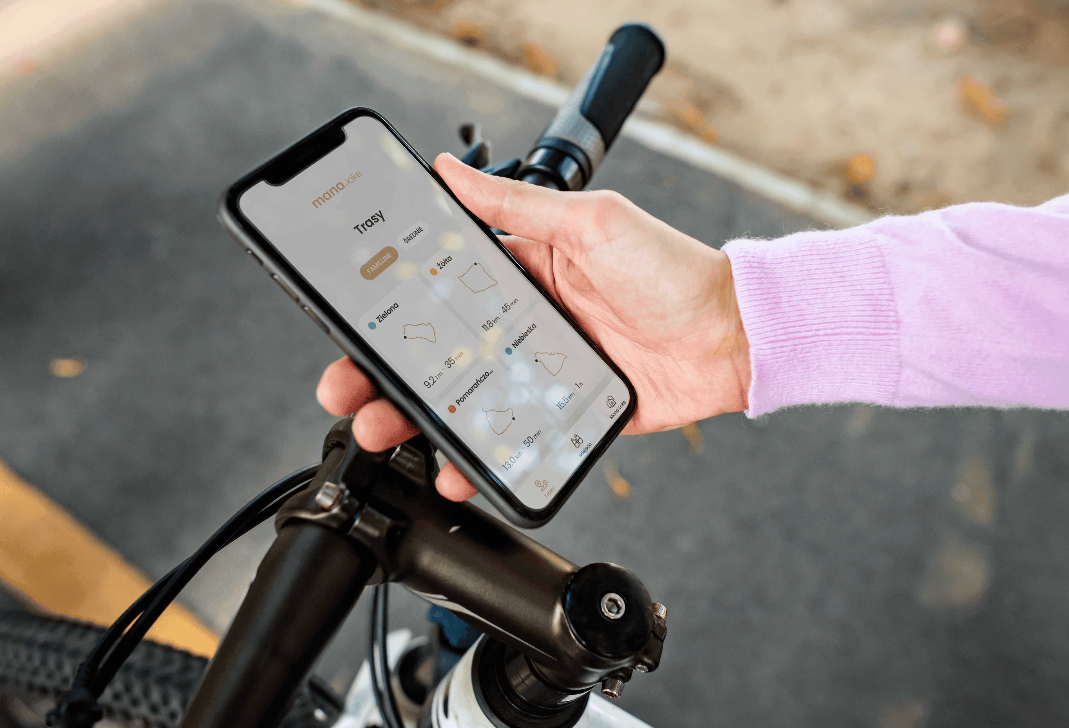

Mana Lake oferuje gościom wyjątkowy sposób poznawania okolicy dzięki wyznaczonym trasom rowerowym prowadzącym przez interesujące miejsca warte odwiedzenia.
Design i Aplikacja mobilna
Kodujemy to, co inni tylko planują
Gotowy na kolejny krok? Skontaktuj się z nami już dziś i stwórzmy razem coś wyjątkowego.
Zaczynajmy!