Usability Audit for Flexi.pl – A Platform Empowering Professionals 50+
Helping a social-impact platform better connect with users through clarity and usability.

Kim jest klient?
Flexi.pl is a job portal tailored to individuals aged 50 and above, offering professional opportunities and flexible work arrangements. As a platform rooted in social purpose, its mission is to promote lifelong activity and enable companies to benefit from the experience of mature professionals.
Wyzwanie
The team at Flexi.pl wanted to understand how their website performs in terms of usability and visual clarity. Our task was to identify key pain points in the user experience – especially from the perspective of their primary audience—and provide actionable insights to guide future improvements.
Despite being a preliminary audit, our findings pointed to crucial areas requiring refinement: visual inconsistencies, complex navigation, and accessibility gaps that could hinder older users from engaging confidently with the platform.
Nasze podejście
Key Insights & Focus Areas:
- Navigation clarity: Redundant menu structures and lack of emphasis on primary calls-to-action caused confusion among users.
- Value communication: The unique mission of the platform (empowering 50+ professionals) was not highlighted strongly enough on landing pages.
- Conversion flow: There were missed opportunities to guide users from informational sections to registration and job-matching features.
- Trust-building elements: Testimonials, social proof, and onboarding guidance were underutilized.

Heuristic Analysis & User Flow Review
We conducted a heuristic evaluation based on Nielsen’s principles and analyzed user pathways to identify structural and functional issues affecting engagement.

Accessibility & Content Structure
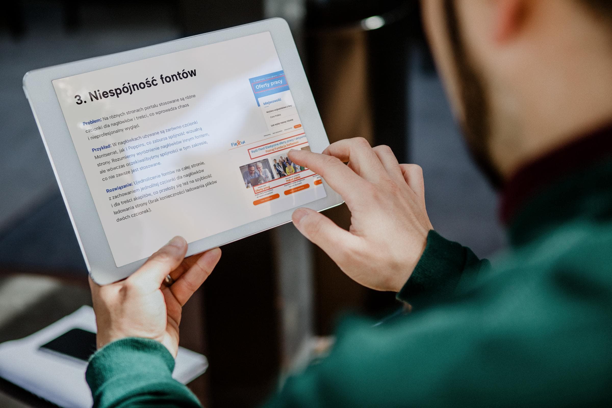
Special attention was given to font sizing, spacing, heading hierarchy, and interaction design—especially elements critical to users over 50 years of age.
Rezultaty
The audit provided actionable insights that served as the foundation for future UX improvements across the Flexi.pl platform. Our analysis highlighted several usability bottlenecks and clarity issues that could impact trust and user retention, especially among first-time visitors and older users.
Visual Refresh Recommendations
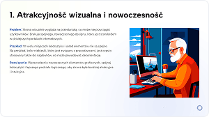
We proposed a modernized visual language with a unified color scheme and logical layout to make the site more attractive and intuitive.
Consistent Typography System
We highlighted the need to standardize font families and sizes, eliminating visual noise and improving readability.
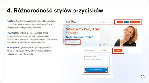
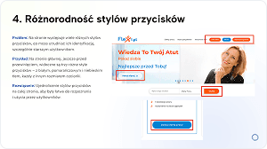
Button Design Unification
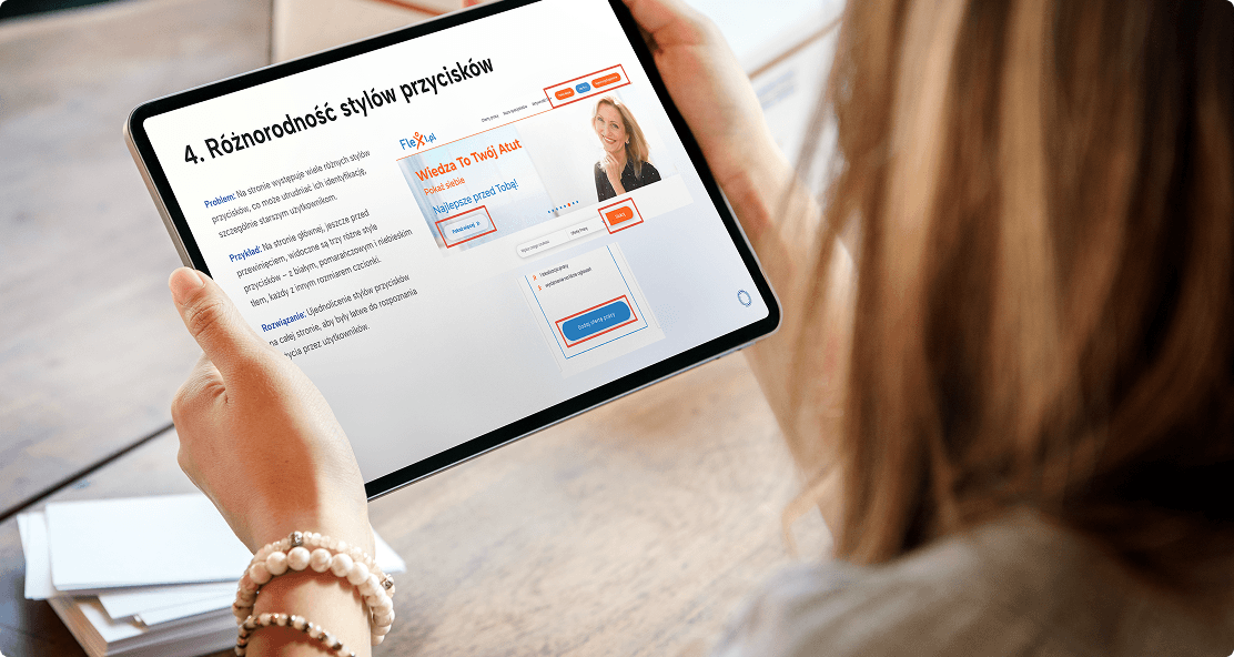
A consistent button style system was suggested to reduce user confusion and support ease of use, especially for the 50+ audience.
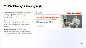
Improved Navigation Patterns
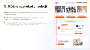
From sliders to section widths, we identified ways to streamline movement across the site, making it more accessible for all users.
Accessibility Enhancements
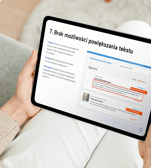
We addressed critical gaps like the lack of text enlargement features, which are essential for users with visual impairments.
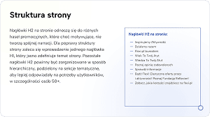
Better Content Hierarchy
We provided guidance on optimizing header tags (H1–H3) and aligning them with search engine best practices and user expectations.
These findings laid the groundwork for strategic UX decisions aimed at increasing user trust, simplifying the experience, and supporting Flexi.pl’s broader mission.
Zobacz także
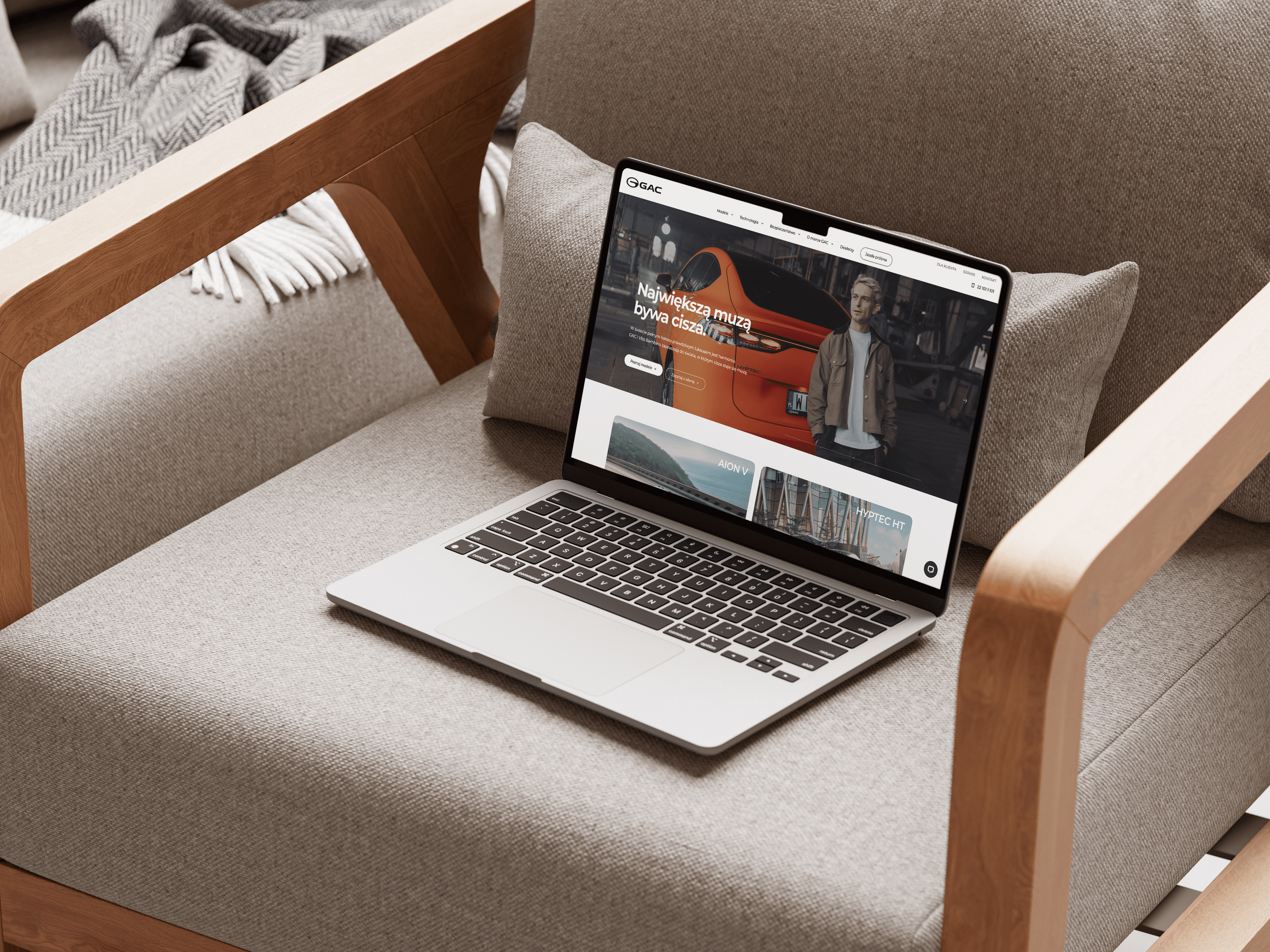

Błyskawiczne wdrożenie nowoczesnej, wydajnej strony internetowej dla oficjalnego dystrybutora GAC w Polsce, wspierającej dalszy rozwój marki i jej obecność na rynku.
Aplikacja webowa i Design
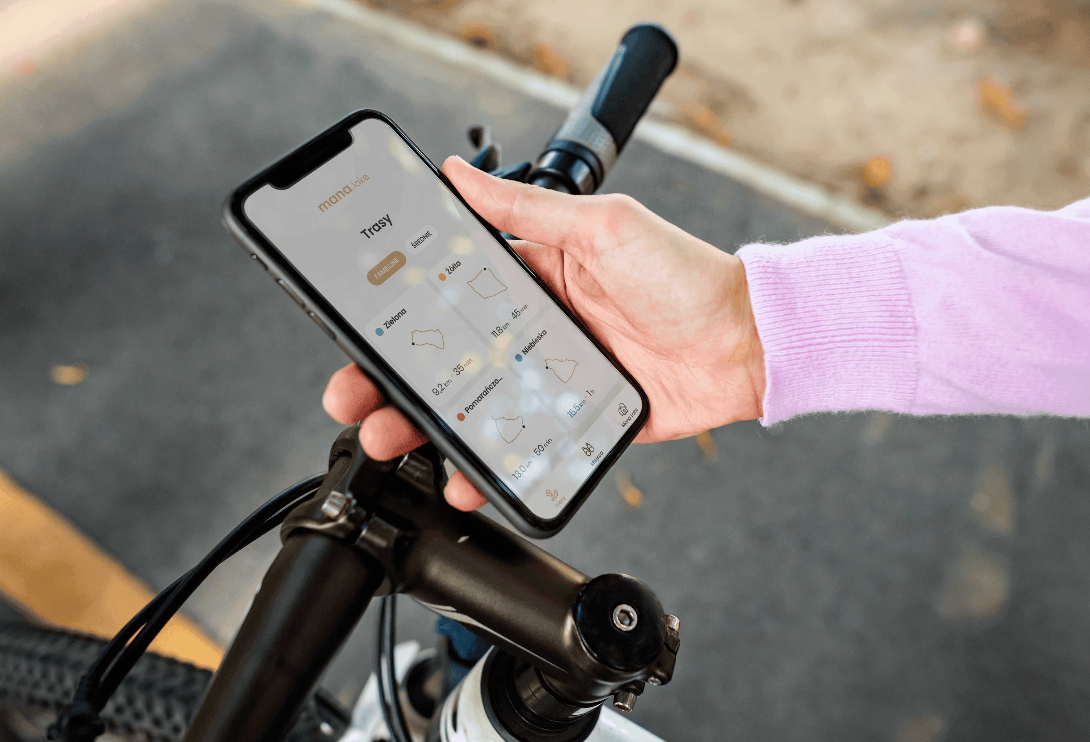

Mana Lake oferuje gościom wyjątkowy sposób poznawania okolicy dzięki wyznaczonym trasom rowerowym prowadzącym przez interesujące miejsca warte odwiedzenia.
Design i Aplikacja mobilna
Kodujemy to, co inni tylko planują
Gotowy na kolejny krok? Skontaktuj się z nami już dziś i stwórzmy razem coś wyjątkowego.
Zaczynajmy!